Quartz Consultancy Brand Identity
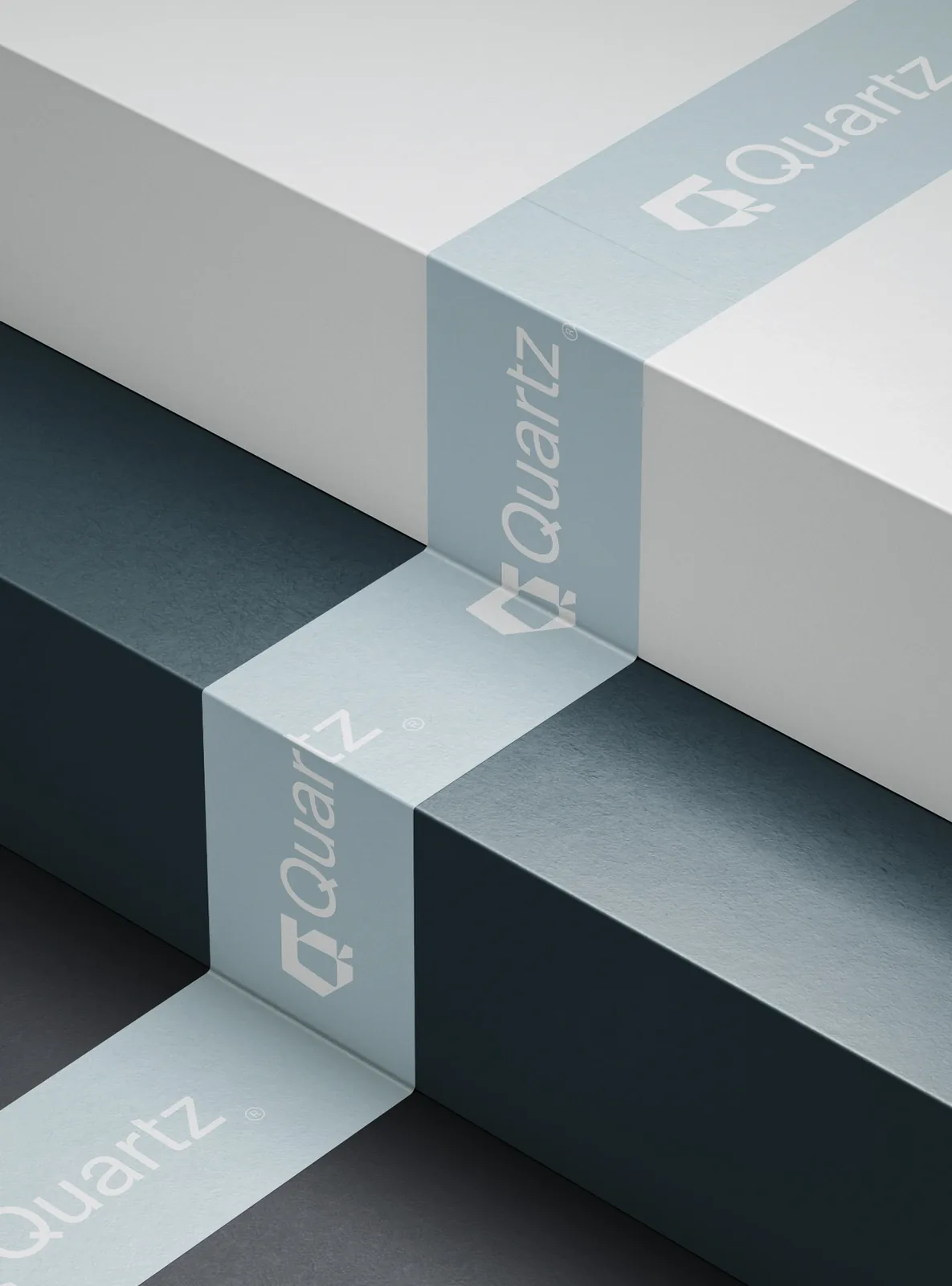
Quartz Consultancy represents a cutting-edge fusion of real estate expertise and global commodity trading, embodying precision, resilience, and strategic aproach. The name "Quartz" was deliberately chosen for its connection to the earth, as a symbol of both the solid foundation of real estate and the natural minerals traded by the firm. The geometric elegance and sharp contours of the logo reflect the multifaceted nature of quartz—strong, enduring, and invaluable—while also conveying one of the organization's core values: transparency. These design choices encapsulate the firm’s commitment to clarity in complex markets, strength in execution, and a polished approach to global operations, resonating with clients who value both authenticity and precision in their investment endeavors.